News Redux
July 17, 2011Digital news is broken. Actually, news itself is broken. Almost all news organizations have abandoned reporting in favor of editorial; have cultivated reader opinion in place of responsibility; and have traded ethical standards for misdirection and whatever consensus defines as forgivable. And this is before you even lay eyes on what passes for news design on a monitor or device screen these days.
In digital media—websites in particular—news outlets seldom if ever treat content with any sort of dignity and most news sites are wedded to a broken profit model that compels them to present a nearly unusable mishmash of pink noise…which they call content.
In an effort to disguise and mitigate the fact that they have little idea how to publish digital content properly—often sneakily called “differentiation”—some news outlets release apps for digital devices. These apps typically (but not always) do a better job of presenting content and facilitating navigation, but they’re a band aid on a festering abdominal wound. Digital media is simply digital media; if you do it right you publish once and it works anywhere. If you’re using an app to deliver content, you’re doing it wrong.
Instead of working with a handful of redundant, mitigating formats (websites, mobile sites, apps, etc…) for content delivery to popular devices, news organizations should simply deliver it correctly in the first place, one time; using html, css, JavaScript, …oh, and design. The employment of content design would be quite refreshing, actually.
News Today
Some news sites are done better and some worse, but The New York Times presents a rather typical example of terribly-designed news. As they are somewhat well known in the news industry, I’ll use their site as the redux example in this article (know, however, that it is news in general that I’m talking about).

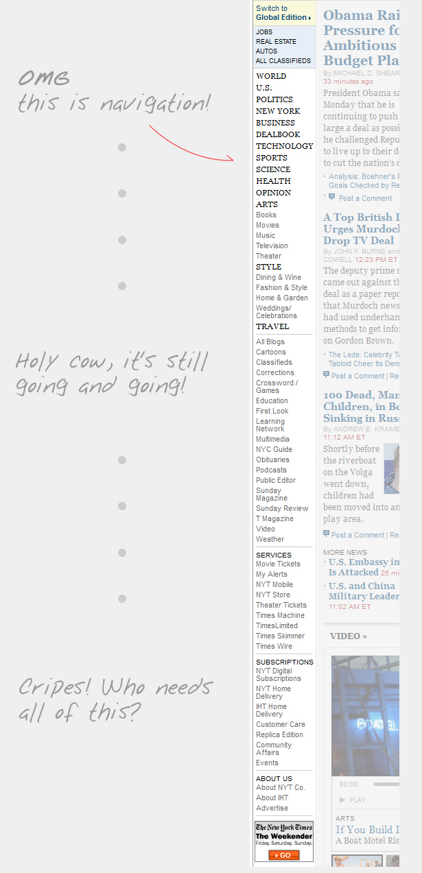
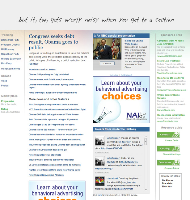
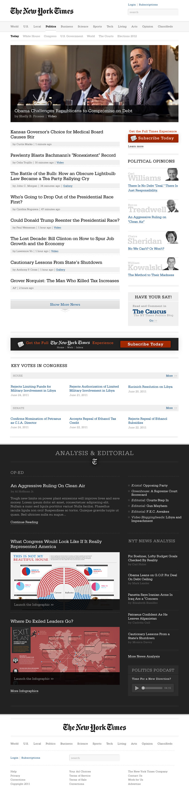
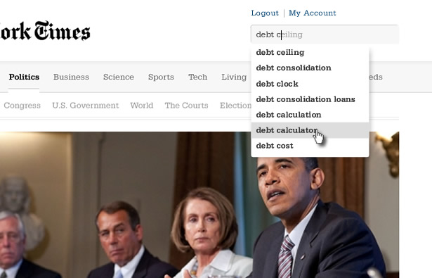
The Times politics page. I think the object of the game must be to fit as much “content” onto the page as possible in an effort to overwhelm the reader, tricking them into believing that the NY Times is just bursting with a mindbogglingly-bottomless array of important information. If only the reader could learn to ignore 60% of what’s here, she might have a chance at a pleasant experience. Please stop helping. What you’ve got here is not content, but noise.
It is hard to believe that the Times, or any other similar publication, actually cares about the news when they treat it with this sort of indignity. Worse, the design makes it quite hard and often frustrating to simply scan the news and find stories that one might be interested in. As a news reader, I want to be able to scan headlines and logically find news I’m interested in reading. And by logically, I mean according to clear, usable, undistracted organization and filtering.
Using the New York Times as an example, let’s look at what helps make for a confusing and complex experience.
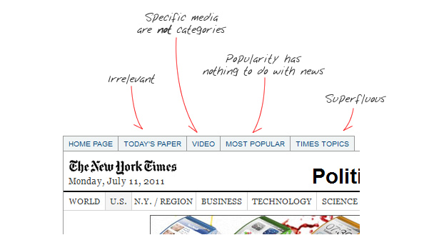
Main navigation:
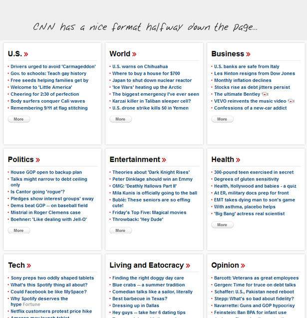
What you need is not a link to every mildly-distinctive item on the site, but usable categorization and filtering. What you need are scanable headlines, not loads of ancillary text and images. Here are some fairly decent examples, but even they are wildly inconsistent and lose their way on crucial pages:


Actually, the Times’ search results page is an excellent example of usable news design:

In all seriousness, one could craft the entire body of section-level pages like this and it’d be wonderful. Article pages would, of course, require full content, but this is excellent, usable news headline presentation.
Mobile Presentation
Mobile presentation of a news web page should be contextual to the device and screen size/resolution, but it should not require anything more than a media query fetching different CSS and perhaps some additional scripting so as to simply restyle the content experience (along with the elimination or addition of content according to the context).
In all fairness to our example New York Times, they have a mobile version of their website, as well as a handful of apps. The apps, as mentioned before, are largely apologetic and superfluous. The mobile site, while a far better presentation, is still miles behind what is appropriate and usable.

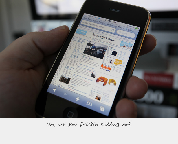
The mobile version maintains the noisy and distracting extra content that typically accompanies a listing blurb for each story. This is a mistake. It requires that the reader either wade through 100 things when 5 would do or it requires that the user attempt to filter out the cacophony of distraction surrounding each story. What we need in such a tiny interface are HEADLINES. That’s it! Headlines can be scanned. Headlines should be able to tell us what we need to know in order to decide if the story is something we’re interested in reading.
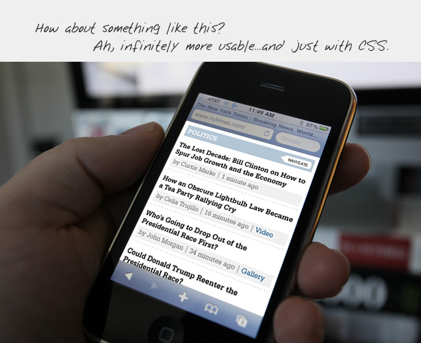
Above: My suggestion for how to present a category page.
News Redux
In working to more appropriately re-imagine digital news, I believe we must first address some fundamental failings of modern news. Among the ideas that need to be addressed are:
- Headlines should describe, inform, and be powerful. They should be the workhorse of the publication.
- There is no “edition.” All news is global. All news is local. “Global Edition” and “Local Edition,” etc… are non sequiturs. Navigation and filters should be rational and easy to use.
- There is no “most popular” news. There is news and there is opinion and they are mutually exclusive. Popularity of stories is something not contextual to news sites, but to social media sites.
- News is not social media. If it is, it fails to be news.
- Those whose news reporting is of low quality avoid the marketplace and instead concentrate on the mob/opinion arena.
- Quality news is valuable. It must therefore have a cost. Quality news is subscription only. You pay for valuable information. Fluff you get for free.
- Quality news requires quality presentation, free from the ridiculous array of experience-destroying marketing. Payment for the PRODUCT allows for this to happen. Experience-destroying penalties for getting the product for free create a broken system while at the same time destroying the value proposition for payment.
Regarding content strategy and mechanism, today’s “news” is rife with irrelevancies and distractions. Part of this is due to the news industry’s abandonment of actual journalism, but much of it is due to thoughtless promotional strategy and pathetic pandering. I suggest that digital news acquire a responsible and more usable approach. For instance:
- “Featured” sections are irrelevant, opinion-shaping editorial promotion; not news.
- Headlines matter and can be scanned; intro text does not and compromises scanning.
- Author, source, and date/time are important.
- Opinion or Op Eds are distinct from news.
- Article ratings or “likes” are irrelevant in the context of news.
- Comments are not contextual to news, but to social media
- Media types (video, gallery, audio) are not sections. These are simply common components of each story.
Given these standards we’re able to achieve a highly useable and, I suggest, more attractive presentation for digital news. Here’s my example for what this might look like.
Here, news is scanable and lovingly presented, giving it the dignity that valuable information deserves. Moreover, opinion and editorial is clearly distinct and separated from news. Given that the New York Times is largely an opinion publication, rather than work to eliminate opinion and editorial from the offering, the individual editorial writers should be promoted as exclusive, valuable properties found only at the New York Times. I’m guessing that the Times should bank on people wanting to read the columns of popular, sought-after opinion authors.
Since news is accessed only via subscription, most of the ads can be eliminated from the pages. Story pages could still have one or two tastefully-presented ads, but preservation of the content is what will keep readers happy, engaged, and willing to continue paying their subscriptions…just like in olden times.
Above: Search should be more usable than is currently employed on most news sites.

Given the more usable presentation, there would be little need for tablet device visual alterations. Though some modified, device-specific functionality would likely be nice. Phone-sized screen presentation is what I suggested earlier in this article; contextual to the limited screen space (and limited attention).
So compare the basic web experience of the current Times politics page with my quick & dirty redux:

Closing thoughts
As with all of my previous redux efforts, this one is not a specific suggestion for how to precisely redesign a specific site. It’s just an exercise to discuss and examine specific issues via quickly-conceived, hastily-constructed visual comps.
Even so, these examples should help clarify for designers (and maybe even media outlets?) how when context is taken into account, users are taken into account, intelligent business models are used, content is treated with dignity, and very basic development strategy is employed, something as crucial as quality news can be delivered in far better fashion than is typically done.
As you can see, I have barely even scratched the surface here. How about you start thinking about better presentations for news online and bring that to your work and maybe even to some further articles.