The Challenge
Create UI, UX, and interaction conventions to support the evolution of a SaaS app.
Already a successful SaaS app, RaiseDonors’ reporting features were rudimentary, so we needed to give our customers the ability to create any number of custom reports specific to their desires and needs. We therefore needed to conceive and build the feature’s interface complement. Because other, equally interactive, new features are on the horizon, the app needed a navigation scheme update as well as the establishment of intuitive UI interaction conventions.
My Work:
- Discovery process planning and exectution
- App structure / IA re-evaluation
- User Interface redesign
- Design system for UI elements and interactions/behaviors
- Navigation scheme redesign

The Interface Design
Introduce a fundamentally sound and efficient design to UI elements and content.
Though the task at hand was to introduce a custom-reporting feature, I thought it best to design the content so that important screens of the app would convey key information without the user having to dig for it. Additionally, I designed that information to be even more communicative with the use of iconry and color conventions for at-a-glance insights. The result is that various sections of the app are no longer mere arrays of discrete data entries, but informative aggregators of helpful information.


This interface design is very much an MVP, but it establishes clear conventions for a design system. With this foundation, along with interface interaction behaviors, real-world user testing will guide the evolution of the design system.
Applying New Conventions
Extend key components of the redesign's conventions to other sections of the app.
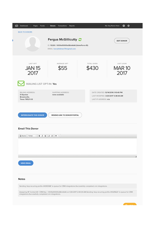
I took the efficient-exposition characteristic of the new feature design to other parts of the app, completely redesigning (for instance) the individual-donor screen to better group information and to provide key at-a-glance insights relevant to the customer's needs.
You can't see the reporting features interface without an account, but you might visit the RaiseDonors website