The Challenge
Create a responsive store design that allows for better promotion, better browsing, and a better user experience at every step on every size screen.
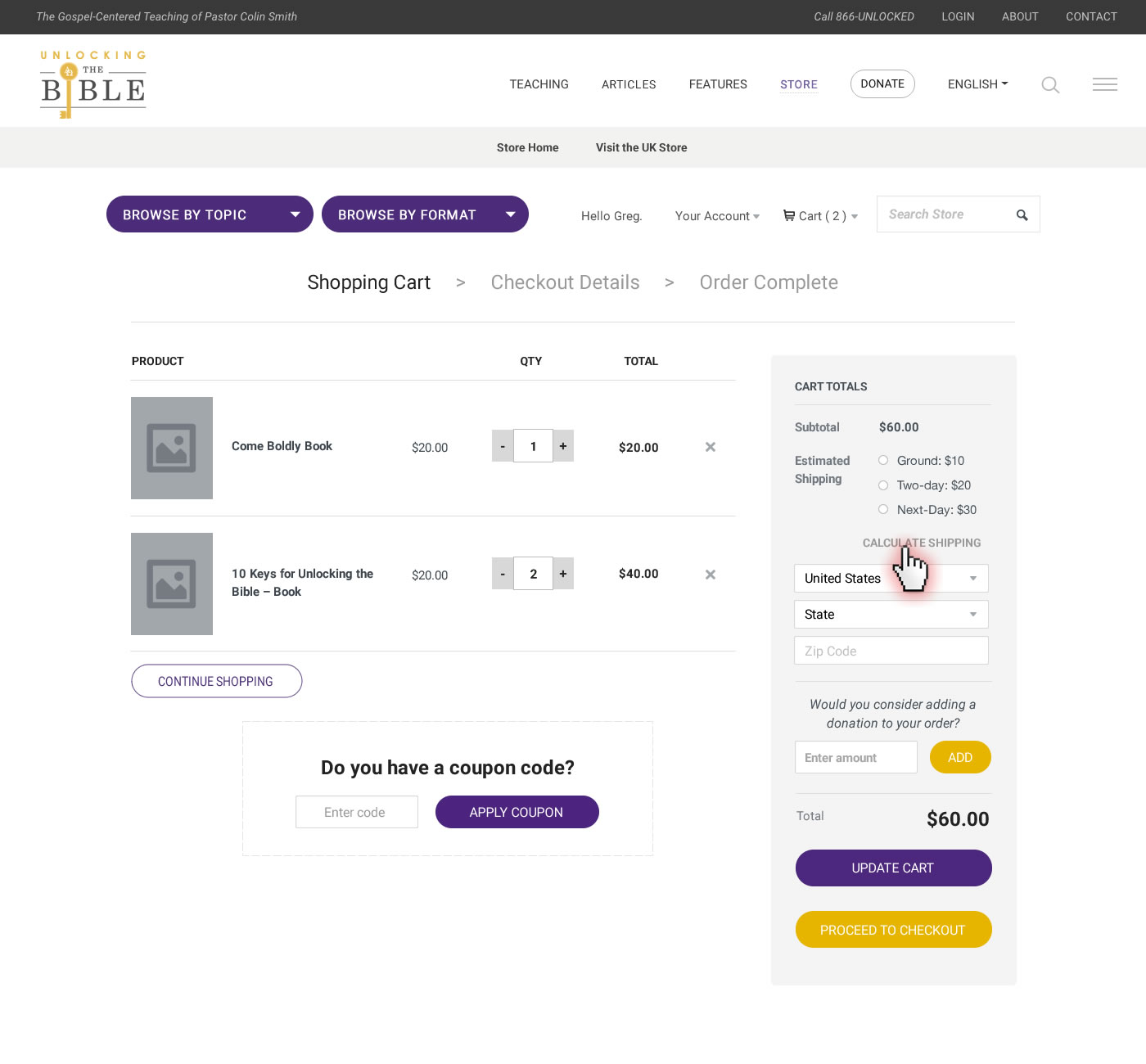
As a part of my team's effort to redesign the website for this growing ministry, we were tasked with redesigning their store. It was lagging behind the rest of the ministry's growth, but not for a lack of quality products! This meant we had to create a better platform for their sales and a better experience for users on all devices. I created a clear content architecture and an intuitive shopping and cart/editing experience that eliminated procedural ambiguity, while streamlining the checkout process.
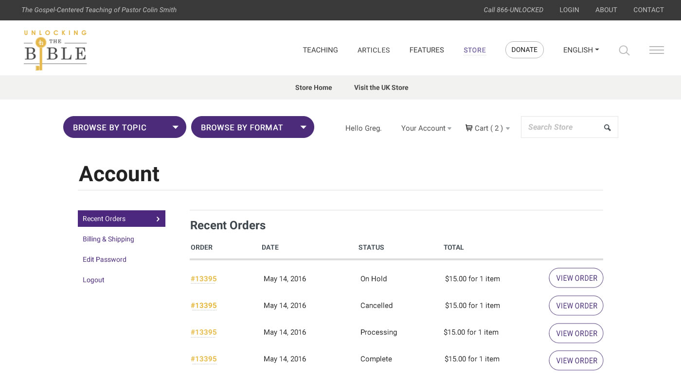
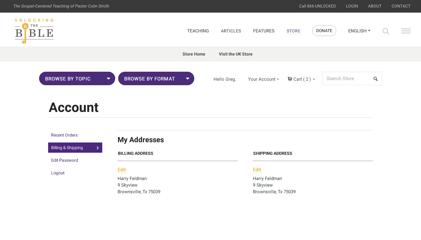
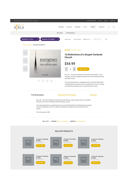
While this effort required of course a great many more screen designs than are shown here, this sampling illustrates the design strategy and content architecture.
My Work:
- Discovery process planning and exectution
- Site structure / IA re-evaluation
- User interface and element-behavior redesign
- Navigation scheme redesign


