Gestalt Principles of Perception - 5: Closure
August 25, 2009It is no accident that the final installment in this article series deals with closure. I’ve put it off until last not because of the clever pun, but because unlike the other Gestalt principles, a responsible examination of the principle of closure involves a host of harrowing contexts: war, deception, political and economic ruin, broken homes, broken hearts, blood, tears, and needless agony. Are you sure you want to get involved with this principle? Are you really so eager to get your hands dirty? Despite what you’ll find everywhere else on the subject, closure ain’t just for making clever logos.
The principle of closure is literally about drawing conclusions. We humans are very adept at drawing conclusions from less-than-all the information. Mostly, we’re good at drawing the wrong conclusions, often with the results mentioned above. But in the reference material you’re apt to find, the Gestalt principle of closure is seldom associated with real life. Common references to the principle of closure are pat, clever, and innocuous; all rainbows and unicorns. In full, the principle of closure is much grittier.
So initially here I’m going to avoid the cliché examples and try to get you thinking a bit differently about closure, even allow you the chance to experience it yourself (your job then is to reflect on that experience and dissect it). Yes, go ahead and Google “Gestalt closure” and look at the clever images later, but don’t avoid the vital conceptual stuff below the surface. Dig deeper.
The Principle of Closure:
When looking at a complex arrangement of individual elements, humans tend to first look for a single, recognizable pattern.
Filling In
When presented with less than the full picture, we attempt to employ the principle of closure to fill in missing information and form a complete image or idea based on common or easily recognizable patterns from our past experience and understanding. And since we almost never have the full picture anyway, the principle of closure is at the core of almost every decision we make, every understanding we claim, and our every effort to grasp the complexity of the world around us. Because we rely on closure so heavily, we sometimes suffer dire consequences when we misuse it …and when it is purposefully exploited to deceive us.
The degree to which the principle of closure works is inversely proportional to the effort required to make it work. So if it is easy to fill in the missing pieces to see a recognizable pattern or form, closure occurs and we perceive the completed form. If too much of the form or pattern is missing, requiring that we work hard to make sense of it, closure is less likely to occur. So in order to utilize closure as an effective design mechanism, you must make it easy for closure to occur.

Before we get to the more design-practical examples of closure, let’s look at a couple of notable extrapolations.
Graphic examples of closure
Fun with closure: Bobby McFerrin compels us to utilize closure in this video
In this example (below) Bobby McFerrin allows us to become familiar with a basic pattern and then everyone delights in the spontaneous employment of closure as we, en masse, accurately fill in the missing pieces when asked to do so.
You may have already seen this video, as it has been making the rounds lately, but watch it again. Notice how easily closure occurs and try and work out why this happens.
World Science Festival 2009: Bobby McFerrin Demonstrates the Power of the Pentatonic Scale
Not so fun closure: Fighting Patton’s Fake Army
In June of 1944, the Germans devoted an enormous amount of men and materiel toward defending against a massive Allied landing at Calais. The Germans knew the landing would occur there and they knew that General Patton was commanding the invasion force. The Germans knew all of this because they had acquired many bits of information that, for them, painted a very clear picture. What’s more Calais had good, easily accessible ports and was very near the German V1 and V2 rocket bases. An assault at Calais made all the sense in the world. One didn’t need to have the official Allied orders in-hand to confirm it.
Unfortunately for them, while the Germans concentrated on defending against a landing at Calais, the invasion on June 6, 1944 came instead at Normandy. In fact, Patton’s entire First United States Army Group was fictitious. It simply didn’t exist and never had. It was part of a ruse to deceive the Germans.
When confronted with only a portion of the picture, the Germans filled in the missing information based on their own logical assumptions and saw a very compelling and much-expected scenario; a recognizable pattern/whole. The rest, as they say, is history.
Simple exercises in closure
Try these on for size. The results may be very unique to you (and therefore quite telling) or may be typical human responses. In either case, the results should give you pause and allow you to extrapolate similar examples.
- Th prchas of a hme s lkely th sngle mst mprtant fnancl dcisn y’ll evr mke.
- 1, 3, 5, __, 9
- There once was a man from Nantucket…
- ** I **** ******* this * swear I’ll ***** ***** *****.
- Ofur recso nad venes eyasr gao…
* * *
These examples, and the video and story earlier, are offered up in order to get you thinking more deeply about how the human mind works. As with any of the Gestalt principles, acquiring a basic understanding of the visual/graphic characteristics of the principle of closure can confer only a shallow understanding of what is going on. Professional responsibility requires that you delve deeper and work to acquire a more comprehensive grasp of why the principle works …or why it might not work in some cases.
More graphic examples of closure
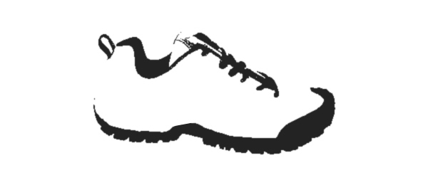
Visually, closure works the same way it does conceptually. We look at seemingly disparate pieces of a picture and we fill in the missing pieces according to a common template that would seem to fit. Certain kinds of images are easier for humans to correctly intuit. Faces, for examples…

Other sorts of objects are harder, but we are generally successful in figuring out what is being referenced, so long as there is enough information to allow for the efficient function of closure (efficient = it takes less energy to see a pattern than to see individual, unrelated pieces).

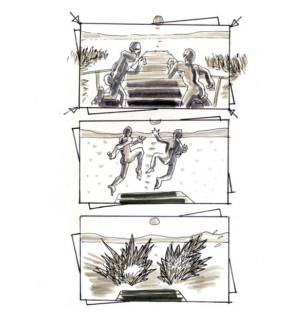
Sometimes, closure fills in the spaces between images to create motion. Instead of seeing snapshots, we see a “video.”


Introduction
Closure is dangerous, volatile, seductive, hypnotic, and even playful. It works to show us an image that does not actually exist before our eyes; it reaches into our experience and into our psyche to create a fiction and compels us to believe it. From these results we construct our opinions, assumption, understanding …our reality.
I mentioned before that closure is about drawing conclusions and I’ve attempted in this article to reference just what a dangerous business that can be. Even when closure works, it may work to tell us a lie. As a designer you must guard against the ways in which the principle of closure can be employed to mislead, to deceive, and to harm. I recommend that you instead employ it to delight and to bring interest to your work. You have great power, and with that comes great responsibility.
I hope that you have enjoyed this series of articles on the Gestalt principles of perception. I also hope that you regard them as not the conclusion to your studies on the subject, but rather just the very beginnings. I have purposefully excluded examples from these examinations, purposefully left things unsaid, purposefully left paths unexplored …all in an effort to allow you the joy of discovery. There is much more. And as a professional you have responsibilities.
I hope that as you examine the individual pieces of these principles a pattern emerges and closure occurs for you. And I hope that you never stop reevaluating your conclusions, whatever they may be.
References:
- Universal Principles of Design, by William Lidwell, Kritina Holden, and Jill Butler
Gestalt Principles Series: