Gestalt Principles of Perception - 2: Similarity
January 26, 2009As Gestalt principles go, the principle of similarity would seem to be one of the simplest to grasp. It states things that are similar are perceived to be more related than things that are dissimilar. Simple enough, right? As a web designer, however, you’ll need to be familiar with all of the ways that elements can be similar so that you can in any given situation choose the right one to exploit. This is because the different modes of similarity are not created equal. Some are strongly communicative while others are comparatively weak …and there is context to consider. It seems that the principle of similarity is not quite so simple as we might imagine.
Similarity is a powerful mechanism for communication. Its power comes from the fact that it is the counterpart to the most fundamental element of meaning: contrast. Here in part 2 of the Gestalt principles series, let’s examine this principle of similarity and how it can be exploited as a communicative mechanism in our web design work.
Fundamentals
There are all sorts of ways that elements can be perceived as being similar, and thus, related. These include similarity of color, size, shape, texture, dimension, and orientation, to name just a few. In order to illustrate some of these similarity modes, let’s do some fundamental evaluations:
Do the elements shown above seem related to one another or not?
As there are very few consistencies among the elements above, it is unlikely that anyone would perceive any significant similarity. As a result, the elements are not perceived as being related to one another in any way.
Let’s make it a bit easier to perceive some similarity:

Which elements above seem related? How?
There are differences between the many elements above, but there are also similarities. If asked to categorize the elements above, almost anyone would say that the strongest communication toward categorization is dependent upon shape. Based on shape, it seems that the squares are related to one another and the circles are related to one another. It is important to note that in this example shape, not proximity or size, provides the strongest communication.
Let’s change things a bit and see how our perception is led.
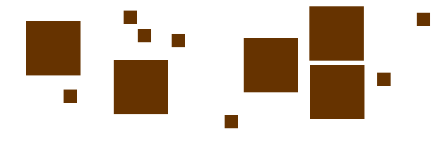
Which of the elements above seem related? How?
In all likelihood, you’ve decided that the large squares are related to one another and the small squares are related to one another. Size is a way to provide contrast, therefore consistency of size can be exploited to suggest relationships.
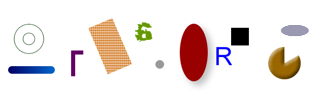
Glance quickly at the image below and then read the question that follows…

Which of the elements above seem related to one another? How?
Similarity of color (or consistent contrast) is the strongest way to suggest relationships. It is also the characteristic that registers first in our perception when our brain is working to make sense of our surroundings. Patterns and chaos can camouflage size and shapes and these characteristics might have only minor variations, but color penetrates these factors efficiently. Because of this fact (or possibly as the reason for this fact) color is often used in nature as a powerful communication tool for danger. Throughout history, a clear perception of color’s communication has been vital to the survival of humans and other organisms.
Okay, let’s move beyond mere survival and get into more practical matters of web design effectiveness with this principle.
The power of similarity in web design
In designing web pages and applications, part of any designer’s job is to provide visual clues as to which interface elements are related to one another. This is done so that the end user or viewer of these pages or applications can quickly perceive organization and make sense of what the designer has created so that they know how to use or interact with it.
Links
Links allow for some of the fundamental interactions inherent to web pages and applications. As such they must be distinguished from other elements around them and they must be somewhat conspicuous—highly or mildly conspicuous, according to the relevant context. But since links share a common function, they generally need to be similar to one another (again, according to context).

In the example above, Douglas Bowman has styled the links in the copy of his Stopdesign site to be blue, contrasting with the overall gray of his body copy. By the principle of similarity, those of us who can distinguish blue from gray automatically recognize that all text styled in this manner is link text.
But it is not necessary that all links be similarly styled in order for there to be clarity. The principle of similarity is quite contextual in our perception. For example, the AIGA website uses a variety of link styles and colors and link text styles—all toward a specific purpose:

Here (above) we can see several different kinds of similarity among text links. The differences in styling communicate differences in context, category, or purpose. Links in the sidebar are underlined and are blue to provide color contrast (and a warm/cool difference for even more contrast) between the sidebar and the main body. In the primary content, there are links of 4 colors; with and without underlines, normal and italic, serif and sans-serif font, emboldened and normal weight, all-caps and mixed-case words.
What is important in this example, however, is that despite the many variations in link color and style we can rather quickly perceive the categorical indications:
- Orange, non-underlined, bold, serif font links are article titles
- Light gray, all-caps, underlined sans-serif font links refer to information category
- Maroon, underlined links refer to people or comments
- Dark gray, underlined, mixed-case links inside of a light gray field refer to actions within a site category (defined in the field)
It is all complex and fussy, but there is some measure of clarity of communication despite the complexity. With a bit of extrapolation and consideration, I’m sure you can think of all sorts of permutations of the principle of similarity as applied to links …and other things.
Page content
When designing and styling web page content, one of the most important jobs we have is to show content relationships—how some content components are related to one another and less related to other content elements. This can be done to reinforce content hierarchies, replace visual structure with implied structure, and generally communicate context.

In the example above, the web applications that 37signals offers are shown here using a consistent visual motif. Most conspicuous is the distinct shape and color palette used for the icons, so we immediately perceive that the four bits of information about their web apps are related in some way. If we then read one of the examples, say the top one for Basecamp, we can then immediately assume (correctly) that all of the other entries that are styled and configured in this manner are also web apps offered by 37signals. Here, consistency of styling and presentation indicates consistency of category or context.
Note that this similarity is reinforced by how the apps’ information contrasts strongly with the surrounding content. Because of this contrast and similarity there is no need to structurally “wall-off” these four elements from the surrounding content in order to show their relatedness.
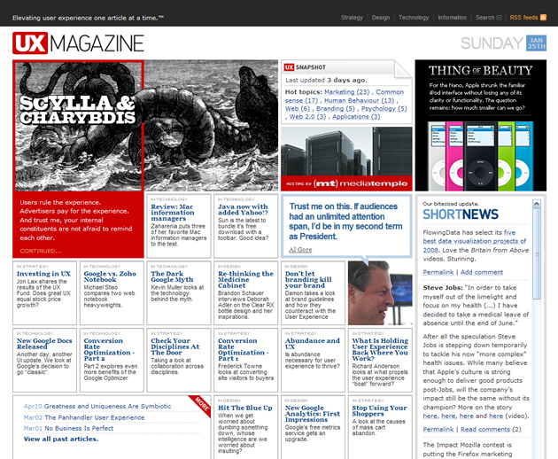
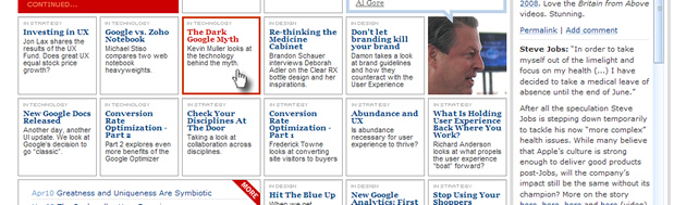
In the example above, the main page for (the now defunct??) UX Magazine uses the principle of similarity to communicate that all of the bits of content that appear inside square, gray-bordered boxes are references (links) to articles. This impression is then reinforced by the user experience: all of these elements have a consistent behavior when a cursor hovers over them (image below).
Organization
Perceiving similarities not only helps us to assume what elements in a layout are related to one another, it also then implies structure based on the patterns that emerge, as demonstrated by the following examples:

The above example shows a grid of elements where no divisional structure is evident. All of the elements seem to be equally related.
This example above clearly shows that the structure is columnar. Since the shapes are consistent, color is the communicative feature here.

In this example above, it is clear that the elements are arranged into horizontal rows.

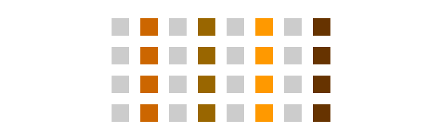
The example above shows that the elements are split into two categories, where all of the gray squares are related and all of the brown squares are related (similar to the AIGA example above). The two sections are clearly distinct, even though this example—and all of the previous ones in this section—have exactly the same physical structure.
In these examples, color (or more fundamentally, contrast) has been used to imply relationships and create structure. These examples offer clear lessons for web designers. Among those lessons is the fact that physical structure is not necessary for describing page structure and content relationships. Instead, one might clearly imply structure based solely on the consistency or contrast of styling and dimension of the content. I’m sure you can extrapolate many lessons from these simple examples.
More simple complexity
Like all fundamental ideas or principles, this is dead-simple stuff; and yet this simple principle has nearly unfathomable depths. In this fact we find one of the dangers of simple concepts: if we imagine only simple extrapolations from simple ideas or fundamental principles, our efforts will forever be relegated to heavy-handed mechanisms and trite results.
If you follow my articles regularly you are aware that I spend lots of time dwelling on fundamentals. Do not, however, mistake an interest in fundamentals for a suggestion that design must be kept fundamental or simplistic. It is the purpose of fundamentals to open wide doors to conceptual depths, and to the subtleties that lay beyond. Without a keen understanding of the (many) fundamentals, designers will be forever barred from those depths. Study hard.
The next installment in this series will touch on some principles that define how the physical page structures we design create direct and indirect communication.
References:
- Universal Principles of Design, by William Lidwell, Kritina Holden, and Jill Butler
Gestalt Principles Series: