5.
Elements of Refinement and Direction
The Viewer’s Perspective
Aside from basic design and composition, there are other concerns that should be considered in the design process. These things help to tie the composition together or compensate for inherent flaws or shortcomings or help to lead the viewer’s eye to the main point of interest in the composition.
Avoiding Cognitive Dissonance
Cognitive dissonance is the mental state of discomfort that arises when someone’s beliefs or thoughts are in conflict. For instance, if you like the trunk of a bonsai (you like the bonsai), but you believe that the branching is in poor position (you don’t like the bonsai), you have cognitive dissonance; conflicting thoughts. So, do you or do you not like the bonsai?
Truth be told, your audience truly wants to find something interesting or extraordinary in the composition you present to them. If you can help them to find it quickly, while avoiding the flaws, they may then quickly decide (consciously or subconsciously) that they like it. Having made this decision, they will find difficulty in being convinced otherwise.
Cognitive dissonance is also bound up with our egos. Once we come to a conclusion, new data that conflicts with our conclusion induces discomfort. We don’t like the idea that we might not be right. Therefore, our most common response to new conflicting data is to work to discredit it. We tend to believe that this new conflicting data is inaccurate — it has no bearing on our already reached conclusions. "Whew! Now I feel better," we think.
So, help your audience to see the goodness in your bonsai composition and not see the badness (there’s always badness in there somewhere). Once they see the good, they’ll like what they see and the flaws that become apparent later will have diminished impact.
Point of Interest
Sometimes when you first see a raw, untrained tree, you’ll notice that it has a single outstanding feature. You may even find that the rest of the tree is quite ordinary or perhaps not promising, but this one feature makes the tree material worthwhile to work with for bonsai. With this kind of material, an important part of the design work will be concerned with accentuating this promising feature.
One way to accentuate a feature is to work to diminish the impact of the rest of the composition. This does not mean to ignore the rest of the tree but to work to keep the design of the rest of the tree comparatively basic or “quiet.” This way, nothing will interfere with the viewer’s eye quickly finding the main feature of the composition.
Physical Features
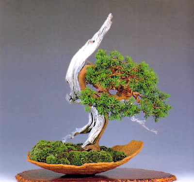
For example, the foliage on the juniper in the image below acts as a frame of sorts. It surrounds the main feature of the tree — the beautiful interplay of the live veins and the dead wood. The foliage forms a beautiful but sedate green frame that effectively sets off the stark beauty of the tumultuous dead wood.

In the example below, the conspicuous proportion of this maple’s surface root structure is obviously the main feature. Styling the rest of the tree in an ordinary and sedate form creates added emphasis for the main feature. Regardless of what flaws may be present up top, our first response to this image is likely, “Wow!”

Color and Contrast
“For me, color was daylong obsession, joy, and torments.”
-- Claude Monet
Yet another way to accentuate the primary feature of a tree is with color. There are many ways to use color to add emphasis or interest to a bonsai. Here are a couple of ways:
Since we cannot generally alter the color of the leaves or trunk on most trees, we have to find other ways to use color artistically to add emphasis to a feature on a bonsai, as in the examples below:
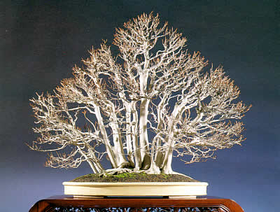
In this example (above), the light color of the pot and the soft, green carpet of moss provide compliment and contrast for the light colored and intricate tracery of bare branches on this beech grouping. The yellowish color of the pot brings out the reddish highlights of the newly forming buds. However…

…Notice in the second image (above) how the dark green pot works against the desired aesthetics, making the contrast too stark and the composition less natural looking and too masculine. Photos courtesy of Bonsai Today.
The Badness
Disguising Flaws
Virtually no tree used for bonsai will be without flaws or less than desirable attributes. Often you may not be able to repair these flaws and you are left with an eyesore on what could otherwise be a very nice bonsai. You may, however, be able to overcome these challenges by way of certain artistic conventions.
Misdirection
Using a method similar to that discussed in the previous section, you can sometimes compensate for a poor feature by working to direct the viewer’s eye elsewhere.
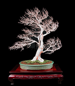
In this example (below), the elm has a poor surface root structure and trunk shape. Also, some of the branches are too straight off of the trunk. In order to make the best use of this material, the artist decided to give the composition great drama, showing the evidence of powerful natural forces in the movement of the secondary and tertiary branches. The first impression is that the tree has been caught up in a sudden gust of wind (rather than, “Ugh, what a sucky rootage.”). The result is that the volume of the poor features is significantly diminished in the overall image.
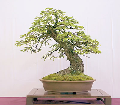
In this example (below), the trunk of the tree has poor taper, but the overall impression is quite nice. Here, the artist has composed the branches in such a way as to take emphasis away from the lesser feature (the trunk taper) and has built a nicer image around the beautiful branching and foliage. The color of the moss compliments the foliage and creates a visual connection, helping the viewer to almost ignore the particulars of the trunk.
This holly bonsai (below) is really quite beautiful, but not because of the condition of the trunk. The trunk is rather ordinary, even unattractive. However, the artist has grown this bonsai specifically for the beautiful image that is created by the light bark set against the brilliant red of the berries. One scarcely notices the poor trunk formation.

In the next chapter we will examine some of the things that can shoot down your efforts at communication — and how these issues can be resolved to your benefit.